
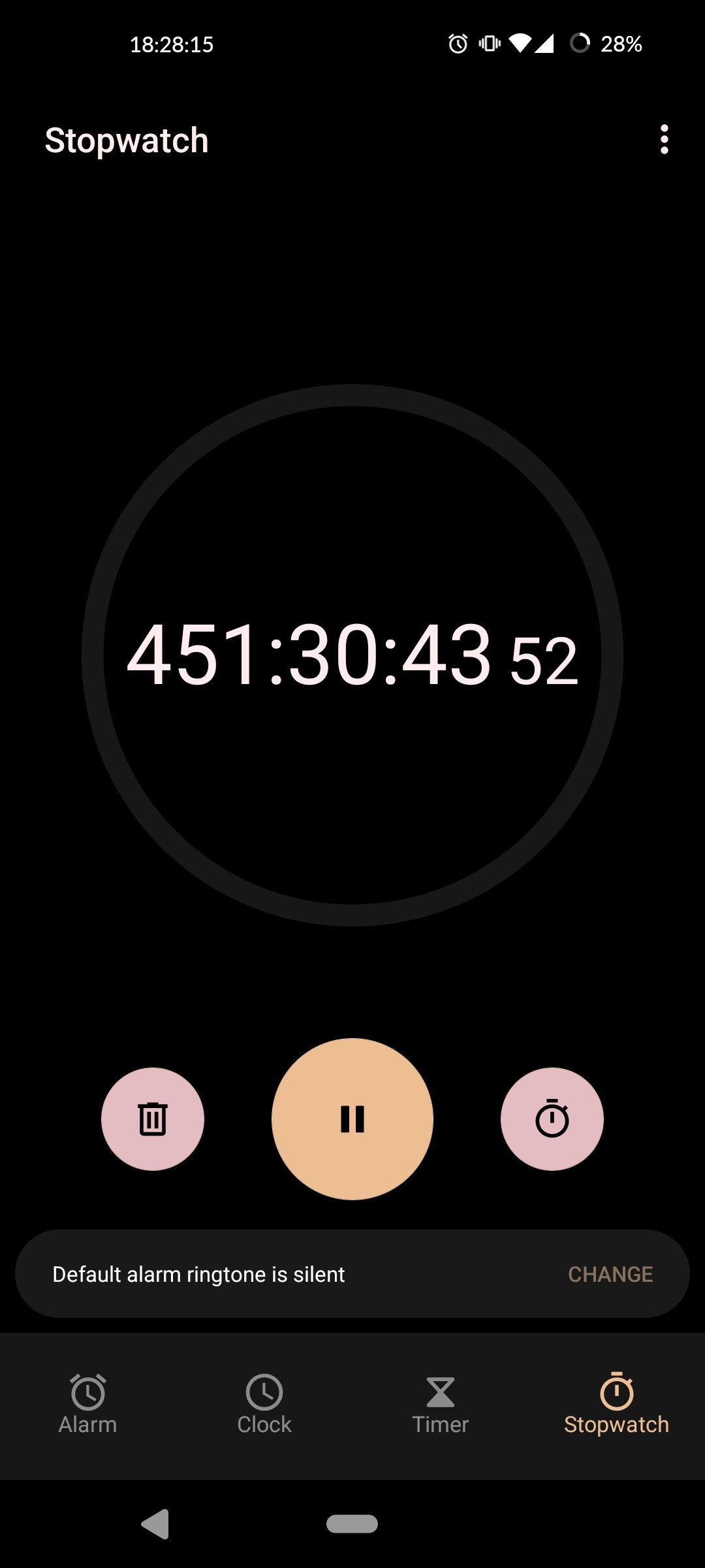
One of the buttons laps the stopwatch, the other resets the entire session clearing all lap markers and stopping the counter. Better not forget which is which, especially given that you’re probably timing something in the physical world not paying much attention to your phone…
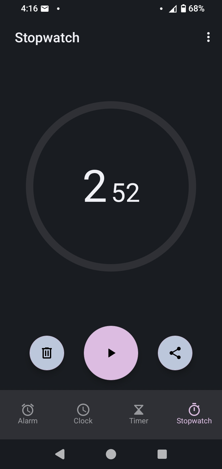
The placement of the numbers and their relative size are ugly too. I understand why the sizes are different, but it looks ugly nonetheless.
Yeah, the circular arrows convey ‘reset’ to me, but the stopwatch icon is ambiguous. Two buttons are visible inside the stopwatch icon, making it unclear what it will do. It should either use the word ‘lap’ or use a less ambiguous symbol like a checkered flag (finish line).
Yeah I think it’s the fact that both are circular icons inside circular buttons of the same color in the same relative position. The reset icon itself is fine.
is that what it is. for point in time readings like laps?
Everything about this is infuriating
Samsung’s clock application did this pretty well, where you don’t even have a reset count button until you press the button that stops the stopwatch from counting.
Foss for the win
That’s a shot from the wrong screen.
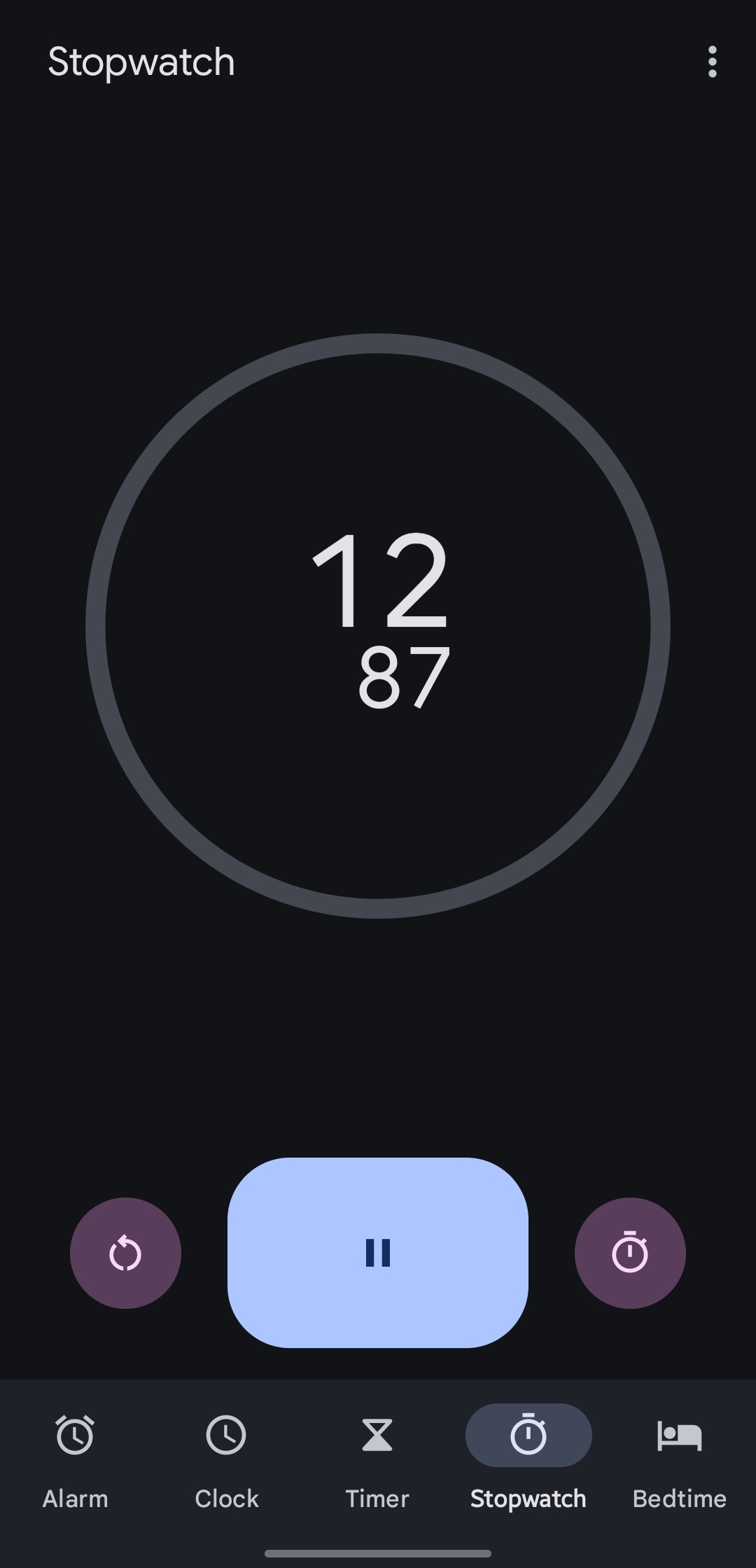
Yeah the AOSP one lineage uses which I assume is the same one this person was using has the same button layout as OP’s when it’s actually running
Lineage OS does its own thing actually. The Google one is proprietary and the AOSP one is abandoned.
Oh interesting, huh
What do you mean?


