
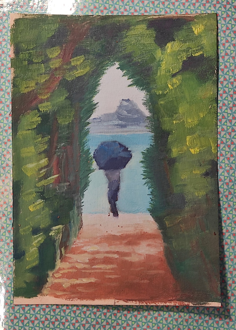
Oil on paper.
Trying a lose style, don’t look too close :-)
You can check out the intermediate steps on my revived (but resetted 😭) lemmy server here lemmy.mindoki.com/c/aip
You must log in or register to comment.
Oh this is really fun! I was scrolling through and saw your piece and just had to take a second and pause. It made me =)!
I’ve got a ping-pong wing-wong kinda brain though and these are the three things that popped up when I saw it: tomie, monet, and a mountain pass
In that order, so take it as you will but I like it. If you want some soft-criticism I would say working on pushing the forms a bit more might be worth having a think about. Because, and this is a personal opinion, I think you can be abstract while still being a little bit neater than what I am seeing in kinda the upper left area abouts. But I understand what all the shapes are, and I think that’s really nice!
The only other thing I would say, and I am not sure if it’s due to value or composition (because it’s very centric in its focus) but as I see it - the figure sits in front of the opening. Although the opening is compositionally clearly in front of the figure. So it creates this real tension with the eyes that causes a lot of bouncing back and forth. But overall it really is a fun painting and I think you did a great job. So take these as you will =)
Wow thank you so much! I love the impressionist style so much, especially Renoir Monet and Manet.
Gotta check out Tomir I don’t know that artist.
All criticisms warmly appreciated and well taken! I know there are lots of errors in the painting, like the values of the sun spots, the green versus the sand, the details missing in the bushes/trees…
I also made the person just slightly too big, and messed up the distinct natural border between the path and the beach (those green leaves to the right) so there is a line but it gets blurred away…
Thanks again it really warms my heart 💖
I just understood your comment about the person sitting in front of the opening. So true, oups!
Maybe the colours needs to be a bit more distant with less red and toned down a bit. Guess I’ll have to try it again!
I love your style. (:
In a weird way, it also made sense to me upside down.
Hey thank you ! I’ll try painting the next upside down 😁
Betty Edwards was a huge proponent of it. And although it personally hurts my brain, it does make things more fun and the results can be quite interesting. As if your evil-twin took control of your paper =P!
Ha ha I know that book in the link with the man sitting!
Great advice to unlock precincieved or just natural ideas we have about how big things are.
It’s very pretty! Relaxing?
Thank you ! Yes I guess it is a very very “boring”/stable composition 😋