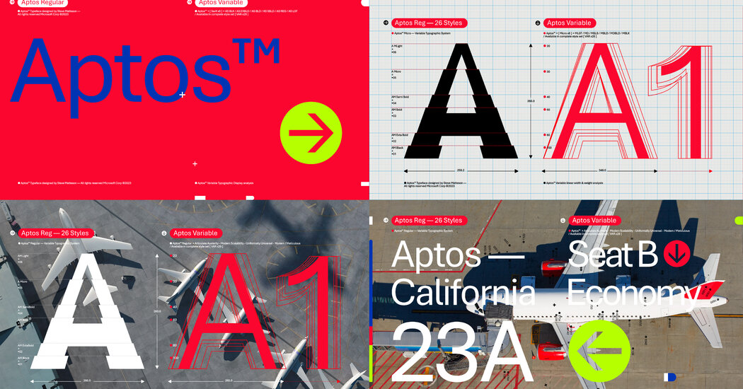
The letters are more pleasant, but my god, that kerning is absolutely awful. It’s horribly inconsistent, and some combinations of letters are spaced apart by half the size of an entire space, while others have barely any spacing.
For as bad as calibri is, at least it was easy to tell words apart.

The letters are more pleasant, but my god, that kerning is absolutely awful. It’s horribly inconsistent, and some combinations of letters are spaced apart by half the size of an entire space, while others have barely any spacing.
For as bad as calibri is, at least it was easy to tell words apart.