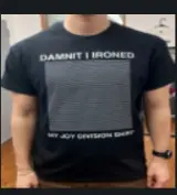
My first thought was this shirt so I was very confused:

Thank you for this.
Honestly, gotta be one of the best album covers ever.
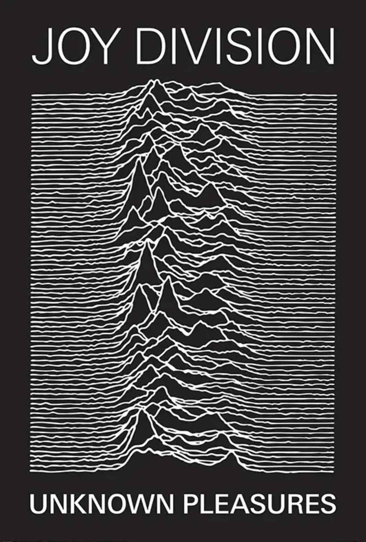
Does the original actually say Joy Division? I thought it was just the waves and unknown pleasures.
The moire pattern in the thumbnail is pretty nice.
The thumbnail is trippy compared to the expanded image. I can kind of see the design in the big image but its still messing with me.

♪ When a grid’s misaligned
♪ With 'nother in behind
♪ That’s a moirèI see a different pattern than I see in your screenshot which makes sense with different instance/client. What’s weirder is the pattern I see today is different than I saw when I first saw the thread. I thought lemmy saved a thumbnail for the image. It makes sense different instances would have different settings for the thumbnail which causes different patterns, but I wonder why my instance’s thumbnail changed over time?
Thumbnail shouldn’t have regenerated and even if it did the generation should be deterministic with a more or less identical outcome. Unless the thumbnail is quite high resolution, the browser/app scaling the thumbnail down again on the fly a second time wouldn’t cause the pattern to change much… Maybe I first viewed it before thumbnail was fully generated or maybe lemmy stores multiple thumbnails at different resolutions?
What’s even stranger is now there’s no pattern at all for me in the thumbnail

This post is gaslighting us I swear.
I freaking love you and cdf for posting these images with context <3
The grid in the image when scaled down causes a moire effect with the grid of pixels used to render it on your screen


