: peeks over fence :
dafuqsgoingonoverthere…
heidee ho, neighborino
Hi, Wilson.
Shut up Flanders
Okily dokily do!
The new logo looks like a shitty AI render lol, perfect representation for how sanitized a corpo it has become.
I’s like the old Bob the Builder vs. The new Bob the Builder
:max_bytes(150000):strip_icc():focal(749x0:751x2):format(webp)/william-dufris-2-4adcc89ac0f0497681d950bdc8dec38e.jpg)
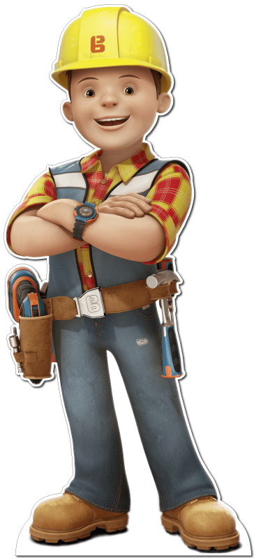
Look how they massacred my boy…
Nah they just made him match the modern builder, he’s a meth head now.b
Holy uncanny valley, Batman
WHY???
There’s a new one??
Nah it looks worse.

5 minutes with bing and I got it to make a nice looking one.
I genuinely just thought that’s what it was. I had not heard of them rebranding…
A nice bot-made logo to celebrate their army of stupid bots ruining everything.
I am a complete amateur, and I do better jobs
I don’t know how to use 3D design software at all and I do better jobs.
Blowjobs don’t count
Looks perfectly suited to the new reddit.
They’re competing with x for the edgy crowd ad dollars. Good riddance to both
This unironically
You serious, Clark?
Reddit? Never heard of it. Did I order coffee from there once?
If you did, someone probably spit in it.
spit with some coffee in it
Something something Narwhal bacon
Midnight
It bacons for thee
Just looks like they suck at icon design and don’t understand the difference between rasters and vectors.
Yes those are words
Looks like we caught ol Vector sitting there rasterbating again.

Much better

HAHA so cute! Ngl if they really implement this, it’ll be dope XD
It’s the community logo lol
deleted by creator

Thanks I hate it.
Oh my god…
Spez: make it the colour of my soul.
I laughed and spit tea on my cat. Kitty was upset until she realized catnip was in the tea. Everyone wins. Well done.
I really like the speech bubble. Makes it very clear that they want to become just another social platform where people, not anonymous accounts, interact with each other.
they don’t want anonymous. if you use a private browser with no fingerprinting or VPN, you can’t even create an account
It’s ugly so it’s a good fit for reddit.
idk what this fascination with using 3d renders as part of the icon is, terrible idea and looks sloppy imo
Logos are supposed to be easily recognized and easily scalable. A 3D rendered logo could be the former but is unlikely to be the latter.
Looks like a failed Dark Reader-converted image but it’s actually intentional this time.
ctrl+sift+A doesn’t fix it
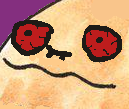
What the fuck is that? Kill it with fire! If it finds a hole it’ll either build a nest in it or try to fuck it.
It’s a disgusting and heinous atrocity, eerily reminiscent of knuckle-dragging dirt person Steve Huffman
Redditent Evil: Welcome to Updoot City
Light from beneath always looks scary. Just think about people who tell scary storys with a flashlight.


