So let me get this straight. It replaces Calibri, but nowhere on the page is a visual comparison of the two.
It seems like something you’d put right at the top.
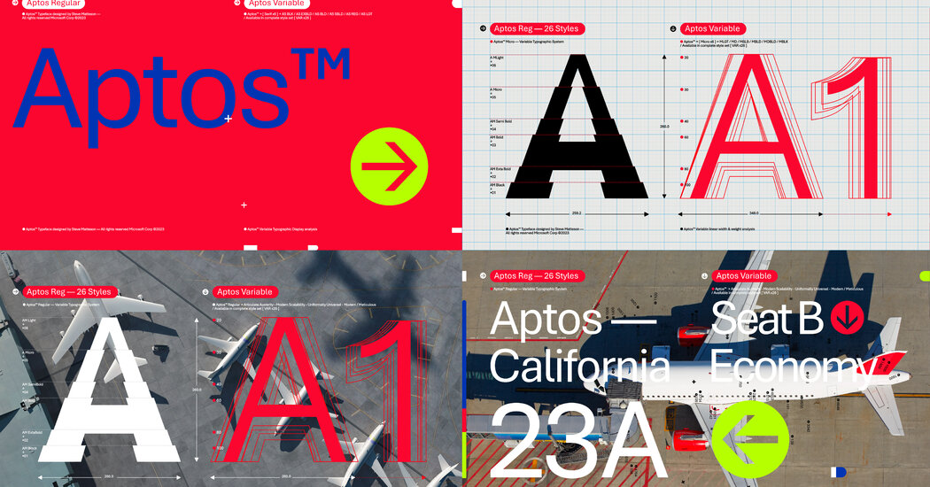
https://office-watch.com/2023/aptos-calibri-comparison/
Slidey thing to compare <3
The letters are more pleasant, but my god, that kerning is absolutely awful. It’s horribly inconsistent, and some combinations of letters are spaced apart by half the size of an entire space, while others have barely any spacing.
For as bad as calibri is, at least it was easy to tell words apart.
The hero we need! Ty!
I’m not entirely sure why but Calibri has always mildly annoyed me. Maybe because it was the new default at one point and I preferred something else. Or maybe because I felt that the default font size should be 10 or 12 points not…11 (pffft huff) Maybe it was just misplaced resentment for having to use Office products (at work). The new one has kind of a fun look, though. Maybe I will enjoy it.
I recall when Times New Roman was default. Calibri felt strange at first.
deleted by creator
I was never a fan of Calibri but the new font looks way too Arial-like for my taste.
Almost feels like it’s more about kerning than actual character changes. Though I do prefer the symbols of calibri.
The kerning is absolutely awful.
Just look at the “cr” in “hovercraft”.
Or the “zy” in “lazy”.
Or the “rtz” in “quartz”.
Or “sph” in “sphinx”.I get that kerning is hard, but the inconsistencies in Aptos actually make it harder to read, despite the glyphs being wider and more distinct.
Ehhh I don’t like the new one. Calibri’s better. I wish it had a better g though.
See? That’s what the original page should’ve had!
I think it’s an improvement. The characters feel a bit more confident if that makes sense. In particular, I think the M Q and S kinda suck in calibri. But honestly calibri kinda sucks in general so doing one up on it isn’t that hard. I think aptos is a bit too bubbly for a default. I do like the curve on the l though. Still I think there are better fonts.
I hate the “h” in the new font.
I agree with you and I also hate lowercase e
f and r are doing me [edit], but you are right e is an eye sore
Love the feel of the new font, the kerning is nice, but it really does have some whack letters. I do really love the lowercase L, I wrote love like that.
At least the ! and @ are much cleaner and not italic.
For me it’s the “l”.
Yeah the h is a bit too short…
I’m really not super font sensitive though, if they weren’t right next to each other I wouldn’t notice
Exact same thought I had lol
No, I’d have to use Word to notice.
LibreOffice is pretty fantastic. And I always know where my files are being saved.
It’s so confusing that you can’t delete a document that you’re looking at, but you can rename it. Identifying documents in OneDrive and then deleting them is tedious.
Don’t get me started on OneDrive. I have rants.
lol lol people downvoted you. So weird
It didnt just affect MS Word, at least the programs i use (outlook & excel) changed, and i assume the whole MS office suite.
What a coincidence, I don’t use any of that software.
The end result, Aptos, is Microsoft’s trademarked intellectual property.
Well, there it is.
This is much the same as Calibri, Arial and other bundled fonts. Even Times New Roman is meant to be licensed for commercial work.
Right, but they’ve changed the default from one that’s been around for about 15 years and for which there are numerous open source alternatives to a new one.
The open source fonts will catch up eventually but really all this is about is them refreshing their proprietary shit for 365, and making it cloud based to boot.
Oh no now I feel old. My first thought was this would be about the switch from Times New Roman to Calibri…
17 years ago …
Doesn’t look super subtle to me. Personally (besides Apple defaults, which are great too), I tend to use Roboto.
I don’t use anything Microsoft so I obviously don’t care, but I think just changing it on existing documents is kind of weird, and people are perfectly justified being annoyed by that. Change it going forward. Don’t alter stuff people already did.
As a type nerd, I’m slightly mollified. I’ve had to spend the last 17 years pretending Calibri is a respectable font and not Comic Sans with a suit and tie
As someone with mild dyslexia, that’s why I liked Calibri so much
I fucking hate Aptos. It makes my work emails (Outlook) look “quirky” and that is NOT what is needed.
Agreed, i do like that its a little more ‘light’ but it also doesnt feel quite as professional or readable.
Subtle? It was immediately noticeable when I wrote my first email after it updated.
I seem to recall changing the default font back to calibri and not thinking much of it.
I’m not an office user but that font looks good to me.
Arial is an old fashioned (designed for paper) font and not even a good one, while Calibri is just a good implementation of the same style of font. Aptos is properly modern with nice wide characters and sensible letter spacing, definitely glad they’ve made the switch.
I would like to represent those of us who use Word everyday and either kinda like it, or just don’t give a shieeeet
Fuck it I’m going back to Times New Roman.
I installed Times New Roman on my Kindle. It’s just so easy to read over long periods of time.
Back? who said it ever left? Default fonts, sure are whatever, but do people know they can change fonts? And it can be whatever you want too, it doesn’t even have to be a Microsoft font.
I don’t use MS Office but I think it looks good and slightly easier to read than Calibri.
I like that they added serifs to lower case l’s. It makes them easier to differentiate between upper case It’s. The lower case E’s look silly.
Of course I noticed! It’s really annoying for a creature of habit like me :(
Still using Office 2003. No changes and working just fine.